Agiya Kelly
.jpg)
Redesigning Urth Caffe's consumer website experience
My Role
Product Designer
June-August 2024
Time Duration
Tools
Figma, Illustrator, Photoshop
Overview
Urth Caffé is a popular chain of organic coffeehouses and cafés known for its high-quality, organic coffees, teas, and farm-to-table cuisine. This European style cafe has several locations in Southern California and Nevada. Key features of their website include their locations and hours, online ordering, catering service, and shop.
Problem
Based on AChecks, a web accessibility checker, Urth Caffe was found to have one known problem and fourteen possible problems. To summarize, the website can make improvements on readability, keyboard controls, navigation, and seizure avoidance.

PROBLEM #1
Web Accessibility
While the font size is appropriate, the serif font style used for the body text becomes challenging to read in larger blocks. Additionally, the use of bright background images with white text on multiple pages significantly impacts readability.

PROBLEM #2
Navigation
The website's navigation lacks intuitiveness, as the navigation bar doesn’t highlight the active page, and users must click through multiple pages to view products. While there is some consistency, button designs and secondary color usage vary, and the loyalty page header uses a completely different font. The content structure is unclear, with a grid layout that lacks containers, making the flow difficult to follow and obscuring the main purpose of each page.

PROBLEM #3
Purchase Flow
The website's premium features or subscription options lack visibility, as the homepage doesn’t showcase products or include a clear call-to-action, reducing sales conversion potential. Pricing information is not easily accessible, requiring users to click through multiple pages to view item prices, which complicates navigation between products. While the checkout process is user-friendly with clear purchase call-to-actions, simplified billing forms, and multiple payment options, navigating back to certain pages can be challenging.
Areas of Improvement
-
accessibility through better readability and clear hierarchy
-
ensuring consistent branding that aligns with the storefront
-
updating the body copy font for a more cohesive and user-friendly experience.
Goals
BUSINESS GOALS
Strengthen the value proposition of core products
Increase user engagement and conversions by implementing a clear and compelling call to action on the homepage, guiding visitors toward key actions such as menu exploration, online ordering, or location discovery
Enhance Accessibility and Performance for a Seamless User Experience
Improve site performance and accessibility by organizing content more effectively, condensing unnecessary pages, and optimizing images to meet color contrast standards, ensuring a seamless and inclusive user experience.
USER GOALS
Effortlessly Locate Cafés and Plan Visits
Create a site that allows consumers to easily locate café locations, access contact information, and get directions to plan coffee meetings or visits effortlessly.
Streamline Ordering and Stay Connected
Optimize the checkout flow so consumers can quickly explore the menu, find nutritional details, and place online orders for pickup or delivery, while staying informed about local events and Urth Caffe's offerings.

Our Users
Before I started designing, I deep dive into existing behavioral data of users based on Urth Caffe reviews across different platforms in order to understand them better.
I focused on identifying the needs that our customers look for in our product.
I defined 2 user archetypes, and mapped them to their respective behaviors, goals, pain points, and needs.
Tech-Savvy Professional: The On-the-Go Coffee Seeker
This user persona is a 32-year-old marketing manager from downtown Los Angeles who is tech-savvy and relies on sleek, intuitive digital experiences.
-
Uses a smartphone or tablet for most interactions
-
Wants to easily find café locations, menu details, and place orders
-
Frustrated by slow websites and hard-to-find information
-
Wants a website that's easy to navigate, with up-to-date locations and smooth ordering
Community-Oriented Retiree: The Informed Café Explorer
This user persona is a 65-year-old retired teacher from suburban Los Angeles with moderate tech savviness.
-
Prefers browsing on a laptop or desktop
-
Wants simple, easy-to-understand websites
-
Interested in local events, menu details, and café locations/contact info
-
Frustrated by complex navigation, small text, and online security concerns
-
Seeks clear fonts, simple navigation, and secure ordering
-
Enjoys visiting cafés and participating in community events
Process

Site Map
I mapped out the structure of the site to have a better understanding of the possible user flows.
Low Fidelity Wireframes
Creating low fidelity wireframes helped me flesh out the structure of the website. At this stage, I focus on functionality and flow over visual details.

Final Design
.png)
Style Tile
By creating style tiles early in the design process, I can align on the visual direction before diving into full designs
Design System
Coming soon.
Coming soon
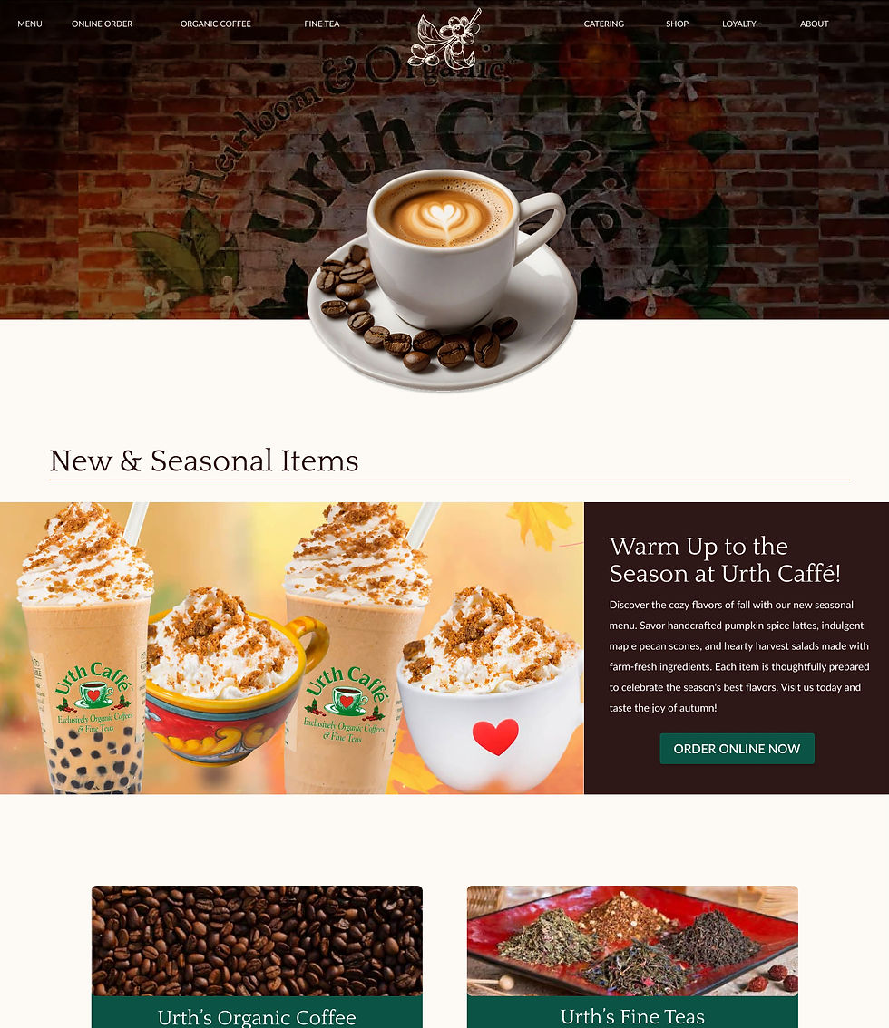
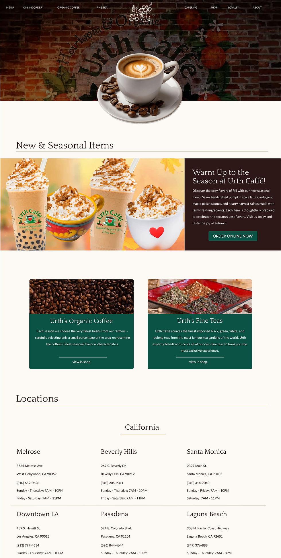
Explore the New Experience
The content is now focused on getting users from point A to point B.


.jpg)
font makes content hard to read
No CTA on top of landing page
color contrast is too weak for readability
CTA for online order flow
better color contrast and use of san serif font for readability
more distinct landing page


The redesign combines elements that work from the previous menu and checkout page.
Item cards to easily compare options based on image, price, and description
consistent branding allows for a more cohesive experience

no hierarchy between price and item information
third party checkout service makes for inconsistent branding and experience